Over the years I have done a great deal of work with Devon Carers and Westbank, and recently they asked me to work with them on this booklet. I enjoy this kind of work, as it’s all about making sure information is put across in a simple and easy to understand way. Whilst the booklet needed to look good, the main aim was to make sure this information was accessible.
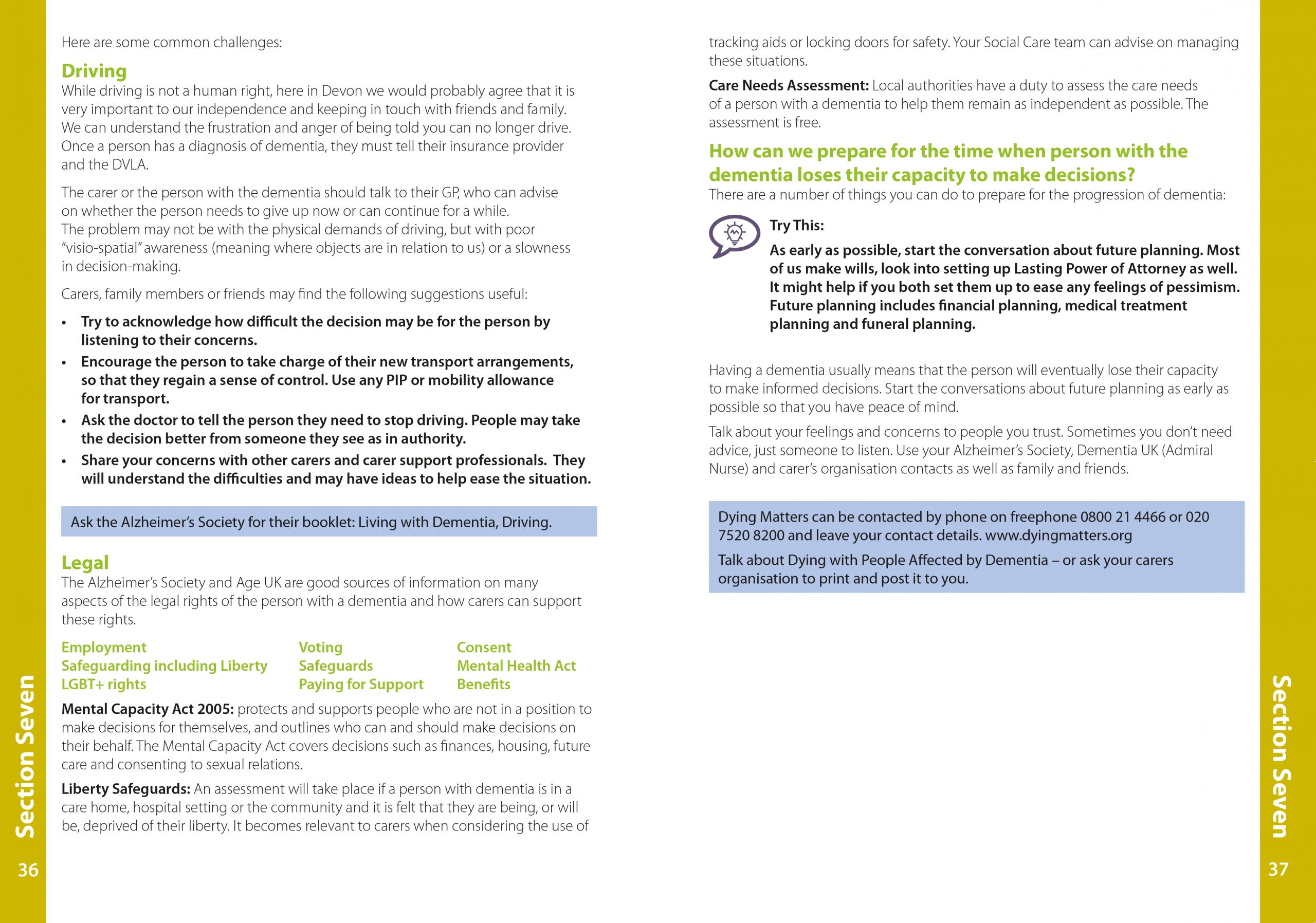
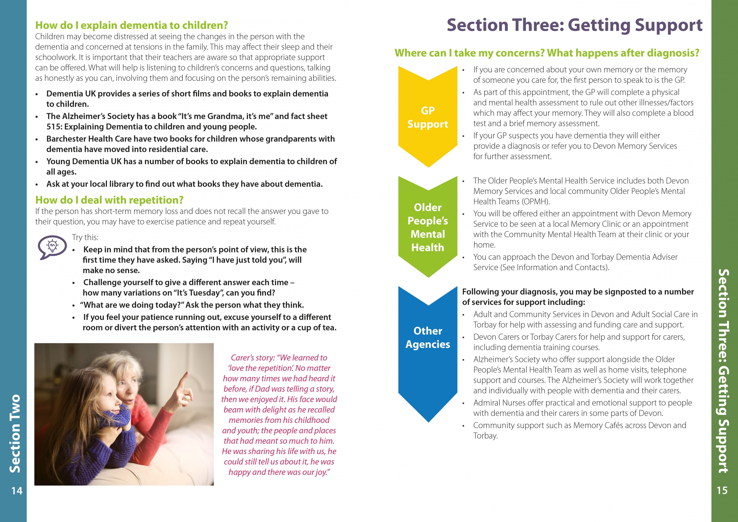
I decided early on to colour code each section, and use a strip down the side of each page so it was easy to find each section. I also wanted to add a little section at the beginning explaining that questions were in green, top tips were accompanied by an icon, and information was in a blue box. I followed this throughout the booklet.

I used images and diagrams throughout to break up the text as much as I could, to avoid large areas of just text, and the booklet cover was filled with as much relevant imagery as possible.

I wanted to ensure the booklet did not look intimidating, and was something that everyone affected by dementia would want to pick up and look at, not an official looking report, but something a bit more friendly and open to all.

As with many pieces of work like this, there are lots of people working on it, editing, checking and proof reading, so this took a little while to pull together! It’s available as a screen version, and a printed booklet, and hopefully it will provide people with the information they need. You can see more images from this piece in my portfolio.
