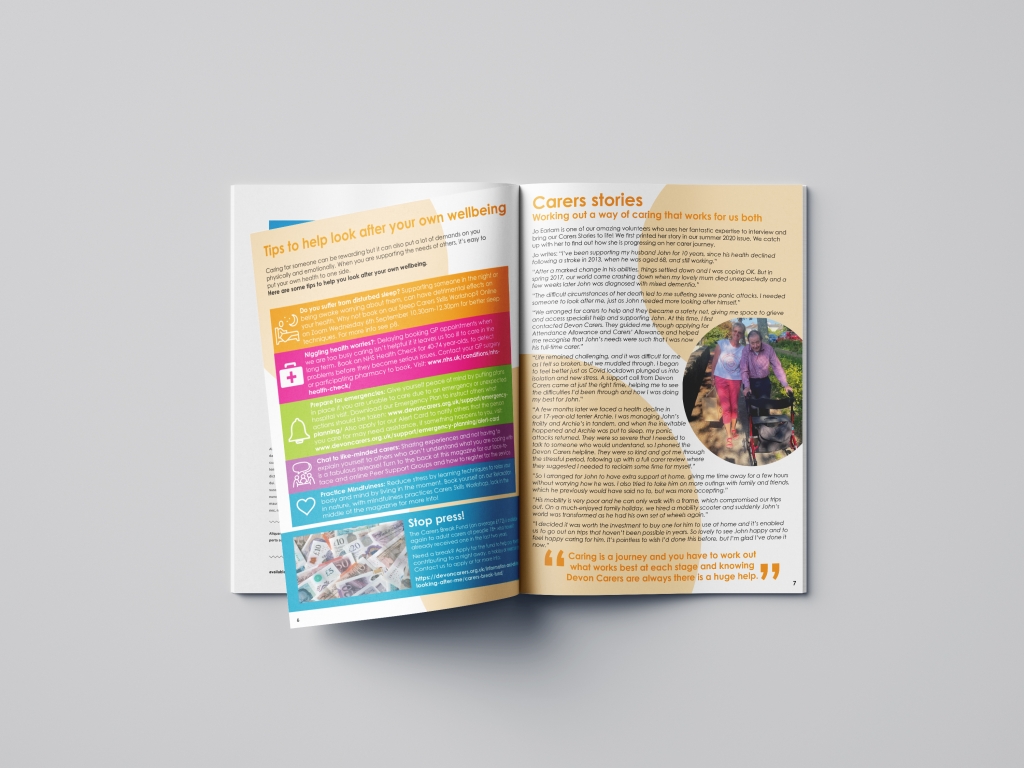
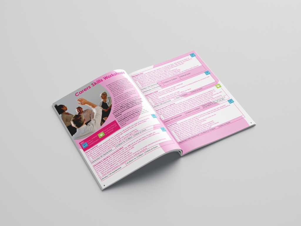
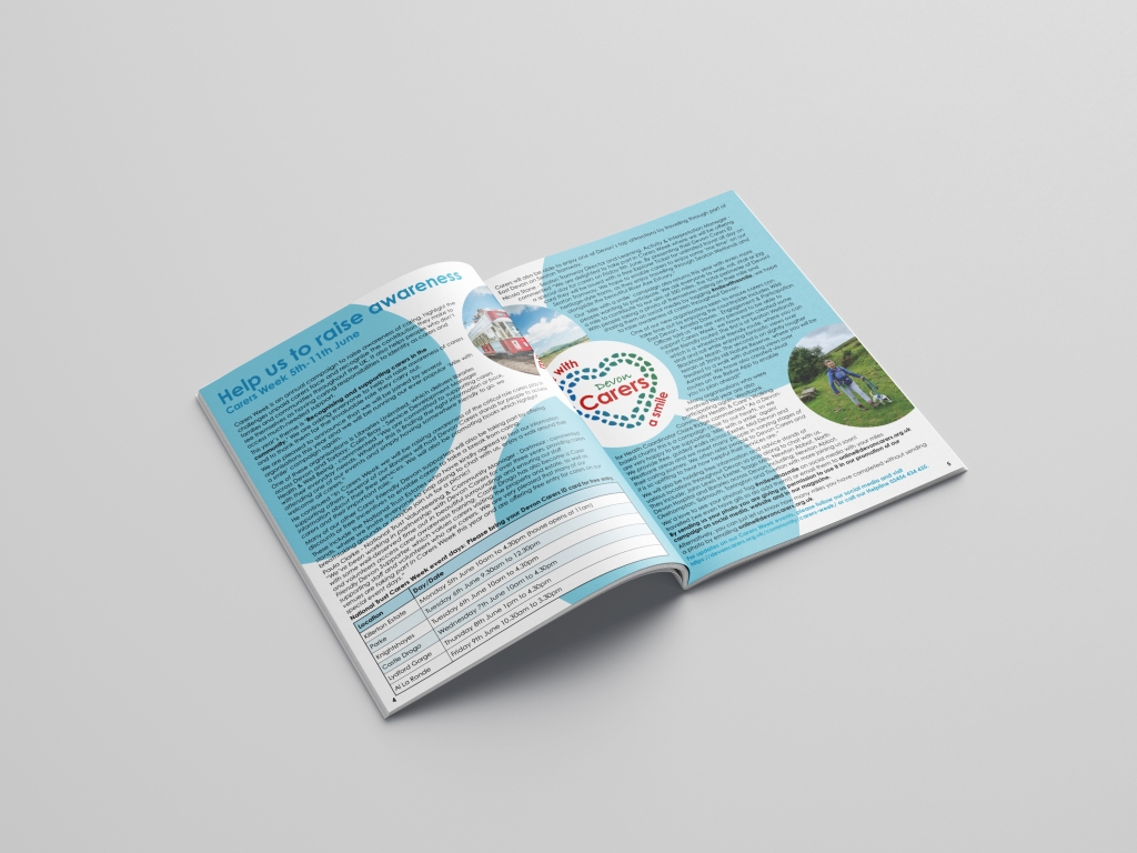
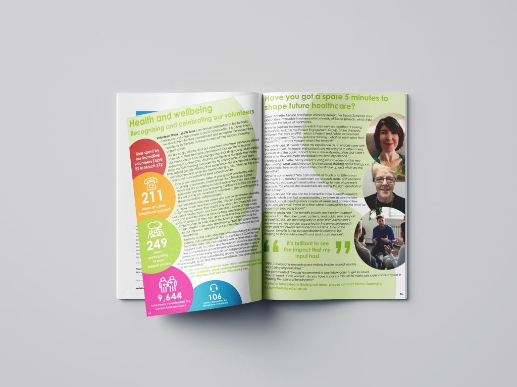
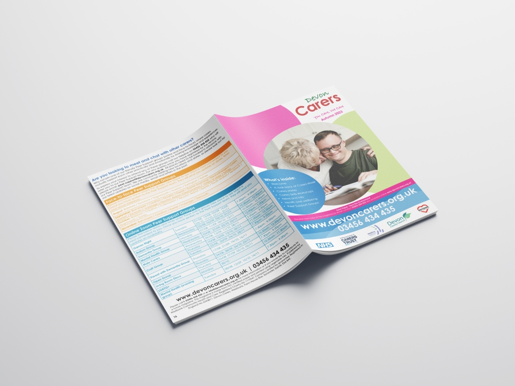
The Devon Carers team have been working on making their brand more cohesive throughout their website and literature. The website uses bold coloured circles throughout, and some of the supporting graphics have changed. With this in mind, we worked on updating the branding for the magazine.


We then incorporated these changes in the main body of the magazine, using the circles as a background, and making the images circular to match. We lost the large section titles, but kept the colour coding throughout.
Finally, the face to face groups have evolved into a mixture of both online and face to face now, and we have reflected this on our back page. With such a lot of information about the groups, we have tried to edit it down to the most important details.
You can see this work in my portfolio.
