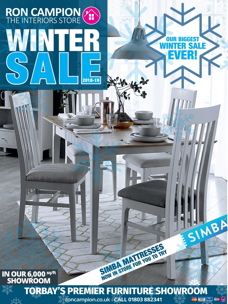
Last winter I worked on the Winter Sale brochures and materials for Ron Campion Furnishers. There was brochure based on previous editions, adverts and banners, all branded with the Ron Campion colours and typography but with a winter sale twist.
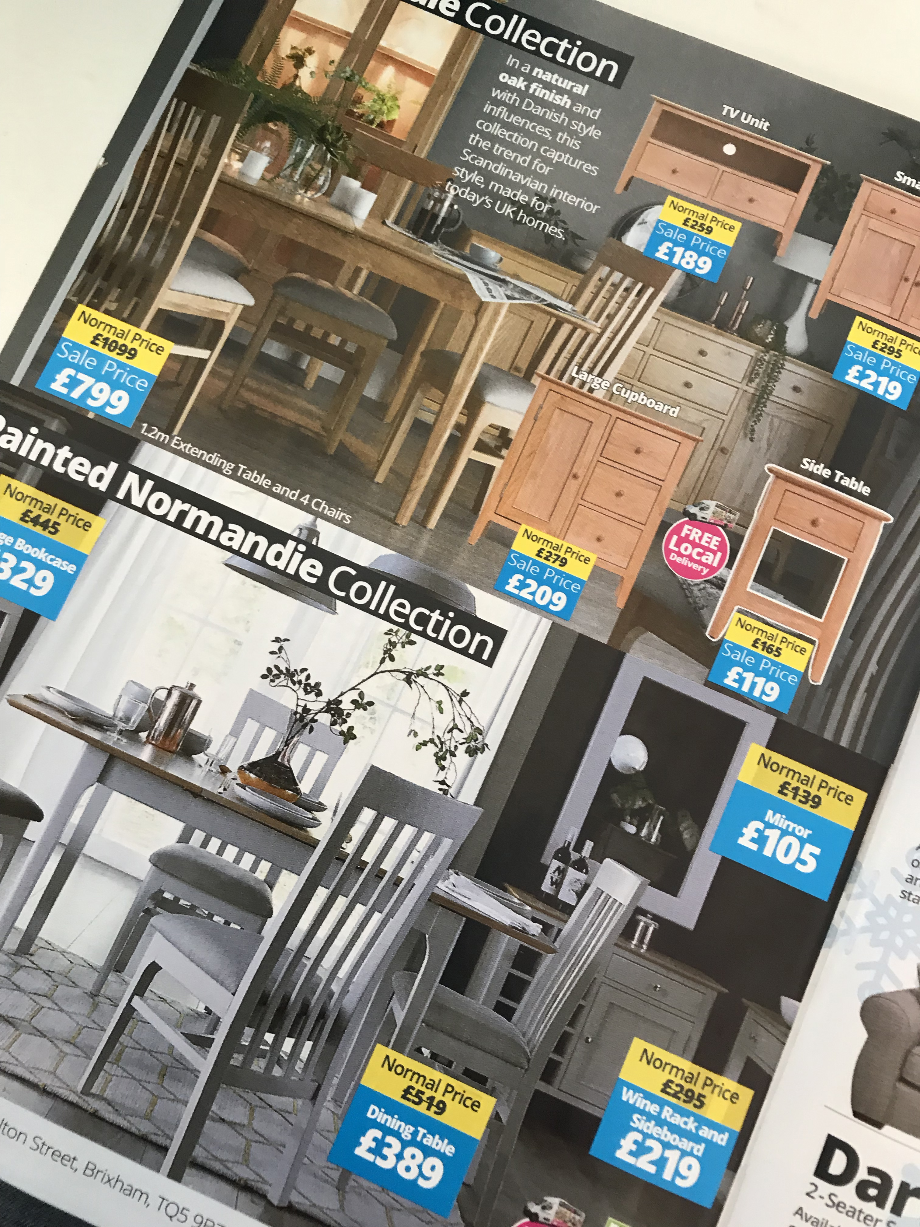
We stuck to the cyan for the primary colour, added some snowflakes and used the typography and styling from previous brochures and adverts. The brochure had a lot of information, but we concentrated on the imagery where we could and designed something easy to flick through, highlighting the furniture and products in general as much as possible.


